

Most support teams are staring at lagging metrics while their operation quietly falls apart. They're watching yesterday's CSAT scores drop, last week's SLA breach reports, monthly ticket counts that describe what already went wrong. Meanwhile the actual problems—routing bottlenecks, knowledge gaps, agent burnout—compound until something breaks spectacularly.
The dashboard that stops problems before they explode
Teams that survive scaling tend to build dashboards around leading indicators, not trailing scorecards. They watch search patterns before tickets spike. They track reopen ratios before CSAT tanks. They monitor routing churn before agents start quitting.
Which signals you watch matters. But what you do when those signals flash yellow matters even more.
Why Traditional Support Dashboards Create Operational Blindness
Support analytics and predictive dashboard design usually fail because teams track comfort metrics instead of predictive ones. Ticket count tells you volume happened. First response time tells you speed happened. CSAT tells you happiness didn't happen. None of these help you prevent the next problem.
Never lose track of a customer request again.
Servyly helps you track, assign, and resolve every ticket quickly and efficiently.
- Centralized ticket management
- Automated response workflows
- Team collaboration tools
No credit card required
The operational reality looks different. A spike in customers searching "refund policy" predicts next week's cancellation tickets. Agents bouncing tickets between queues signals training gaps or unclear ownership. Tickets reopening within 48 hours means your resolution process has holes.
Traditional dashboards also break the connection between metrics and action. Handle time is increasing—okay, what should the Tuesday morning shift supervisor actually do about that? Without clear ownership and response playbooks attached, even good metrics turn into expensive decoration.
Small support teams feel this worse. The team lead juggling queue management, QA reviews, and escalations doesn't have time to dig through historical patterns. They need signals that say "fix this now" with some direction on how.
Leading Indicators That Actually Predict Support Disasters
Search queries reveal customer confusion weeks before it turns into ticket volume. When "how to cancel" searches jump 40% in a week, churn tickets will follow. When "shipping status" queries triple, something in your logistics communication broke.
Here's what predictive signals actually look like in practice:
-
Query volume changes (>30% week-over-week shift)
-
New search terms appearing (signals feature confusion)
-
Failed search rate climbing (knowledge base gaps)
-
Search-to-ticket conversion rising (self-service failing)
Reopen ratios expose resolution quality before customers complain. A ticket reopening within 72 hours means something wasn't actually fixed. When specific agents or issue types show consistently high reopen rates, you've found a training gap or a process hole.
Quality Degradation Signals
-
48-hour reopen rate by agent
-
Escalation rate changes by ticket type
-
Internal note length trending down (rushing)
-
Template usage spiking without customization
Routing churn predicts both system problems and agent frustration. When tickets bounce between queues more than twice, either your taxonomy is broken or agents don't understand ownership. This metric tends to spike two or three weeks before agent turnover picks up.
Workflow Breakdown Indicators
-
Queue transfer rate climbing
-
Assignment changes per ticket
-
Time-in-queue variance increasing
-
Skills-based routing mismatches
The useful part is combining signals. Search spikes plus rising reopens usually means a product problem is brewing. Routing churn plus declining internal notes often means the team is burning out. Multiple indicators moving together tell stories that single metrics miss entirely.
Setting Thresholds Without Creating Alert Fatigue
Raw thresholds create noise. "Alert when reopens exceed 15%" sounds logical until you realize weekend tickets always reopen more because part-time agents handle them. Context matters more than absolutes.
Start with baseline variance, not fixed numbers. Calculate your normal weekly pattern for each metric, then alert on deviations from that pattern. A 20% reopen rate might be normal for password resets but a serious problem for billing issues.
Threshold Framework That Actually Works:
-
Level 1 (Yellow)
2x standard deviation from 4-week rolling average - Owner: Shift lead - Action: Review pattern, flag in handoff notes
-
Level 2 (Orange)
3x standard deviation or Level 1 for 3 consecutive days - Owner: Team manager - Action: Spot audit tickets, implement temporary process change
-
Level 3 (Red)
4x standard deviation or Level 2 for 5 days - Owner: Head of Support - Action: Emergency process review, all-hands briefing
Each level has clear ownership and a defined response. That's what most dashboards skip entirely. Without someone's name attached to each threshold, alerts become background noise.
Time-based context also prevents false positives. Monday mornings always show routing churn because weekend tickets get reassigned. December searches spike because of holiday volume. Build these patterns into your thresholds or you'll train people to ignore everything.
Playbooks That Turn Signals Into Action
Signals without response protocols waste everyone's time. Each indicator needs a documented playbook that any shift lead can execute without a long meeting or executive sign-off.
Here's what an actionable playbook looks like for a search spike signal:
A quick visual of the playbook flow.
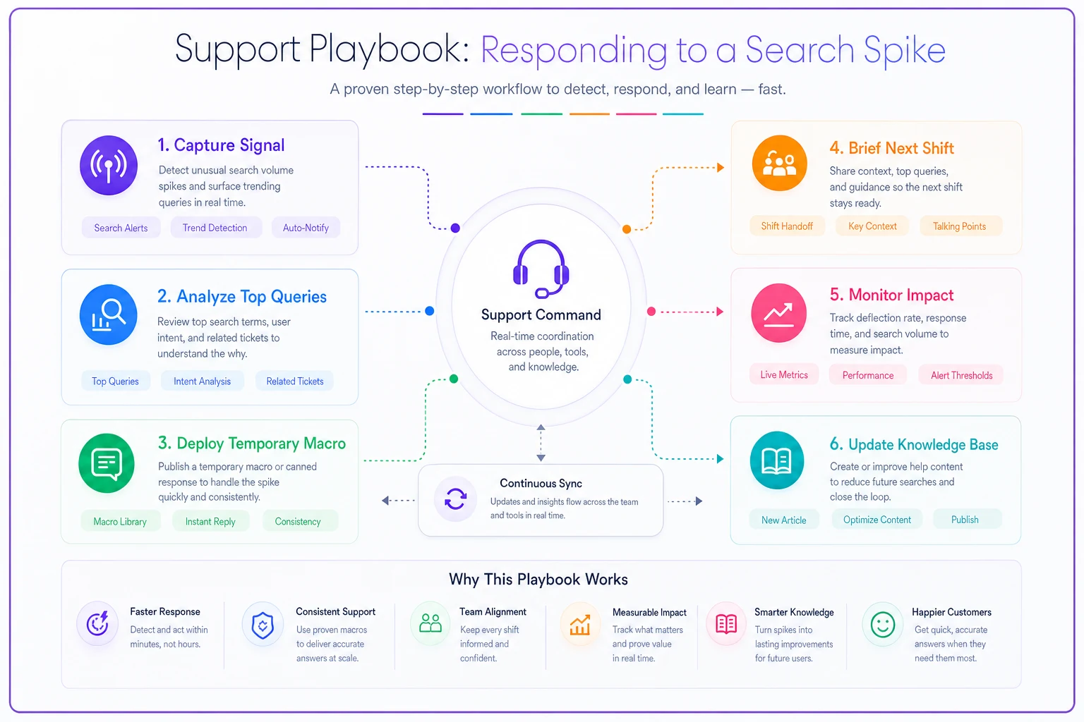
Use this to walk new shift leads through the steps.
When "How to [Feature]" Searches Spike 40% Week-over-Week
Owner: Weekday shift lead
Hour 1:
-
Pull top 5 search queries driving the increase
-
Check if product released changes to that feature
-
Scan last 20 tickets mentioning the feature for patterns
Hour 2:
-
Create a temporary macro addressing the top confusion point
-
Brief next shift on the pattern and macro usage
-
Flag knowledge base manager for article update
Day 2:
-
Review whether the macro reduced ticket volume
-
Escalate to product team if the issue persists
-
Schedule a 15-minute training session on common resolutions
Day 5:
-
Measure search-to-ticket conversion rate
-
Update knowledge base if the pattern continues
-
Document the lesson in the team wiki
The playbook specifies exact timeframes and concrete actions. No vague "investigate and respond appropriately" language that leaves people guessing.
Different signals need different response speeds too. Search patterns can usually wait a day. Routing churn needs adjustment quickly. Build response timing into your operational system based on actual impact to customers and agents.
Experiment Hooks: Testing Fixes Without Breaking Operations
Every signal should trigger small experiments, not massive overhauls. When reopen ratios climb, don't redesign your entire QA program. Test one specific change with one team for one week.
Say your technical tickets show 25% reopen rates. Instead of retraining everyone immediately, try this:
-
Week 1
Add a mandatory troubleshooting checklist to 5 agents
-
Week 2
Compare their reopen rates to the control group
-
Week 3
Roll the successful version to half the team
-
Week 4
Full deployment if metrics improve
Start experiments with one measurable change and one small group to keep operations stable.
Small experiments also make ownership realistic. A shift lead can't overhaul ticket routing, but they can test adding one clarifying question to the intake form. Junior managers can't change product features, but they can test different macro phrasings.
AI automation helps here by running experiments in parallel. Automated systems can test multiple response templates simultaneously, measure which reduces reopens most, then gradually shift traffic toward the winning version—the kind of experiment that would take months to run manually.
Track experiment results directly in the dashboard. When someone sees routing churn spike, they should immediately see "Last fix: Added department dropdown, reduced churn 31%." That institutional memory stops teams from repeating failed experiments and gives new leads something to build on.
Building Dashboards That Managers Actually Use
The most effective predictive dashboard I've seen fit on one screen with six metrics. Each one showed current state, a trend arrow, an owner name, and one-click access to the response playbook. That's it.
Complex dashboards die from neglect. The 47-metric setup with beautiful visualizations and drill-down capabilities gets checked once a month during the review meeting. The simple dashboard with clear ownership gets checked every shift change.
Structure your support analytics predictive dashboard in layers:
-
Layer 1
Shift View (checked every 4 hours) - Current queue health - Active alerts with owners - Experiment status - Handoff notes
-
Layer 2
Daily View (checked each morning) - Leading indicator trends - Threshold breaches - Playbook activation log - Resource adjustments needed
-
Layer 3
Weekly View (checked in team meeting) - Indicator correlation patterns - Experiment results - Process change recommendations - Prediction accuracy review
Mobile accessibility matters more than features. The shift lead dealing with a routing crisis needs to check thresholds from their phone, not wait until they're back at a desk. If your dashboard isn't usable on mobile, it's already failing half the use cases it was built for.
Ownership Models That Prevent Dashboard Theater
Dashboards without owners become expensive wallpaper. Every metric needs a person who actually loses sleep when it goes red. Not a team, not a role—a name.
Map ownership to realistic authority levels. Don't make junior agents own reopen rates when they can't change resolution processes. Don't make directors own hourly routing metrics when they're in meetings all day.
Practical Ownership Matrix:
| Indicator | Primary Owner | Backup Owner | Escalation Path |
|---|---|---|---|
| Search patterns | Knowledge Manager | Senior Agent | Content → Product |
| Reopen ratio | QA Lead | Shift Supervisor | QA → Training → Ops |
| Routing churn | Operations Analyst | Team Lead | Ops → Tech → HR |
| Response variance | Shift Supervisor | Team Lead | Supervisor → Manager |
Rotate ownership quarterly to prevent burnout and build broader understanding. The agent who owned search patterns last quarter has a much clearer picture of how knowledge gaps create tickets downstream. That cross-training makes operations more resilient over time.
Display owner names on the dashboard itself. During incidents, everyone knows exactly who to contact. During improvements, everyone knows who to credit.
Common Predictive Dashboard Failures (And How to Avoid Them)
Failure 1: Tracking everything equally
Teams add every possible metric because data feels free. Then alert fatigue sets in and people ignore everything. Pick 5-7 leading indicators that actually predict problems you can fix, then add more only after the first set drives consistent action.
Failure 2: Perfect thresholds that never fire
Setting thresholds too high means problems explode before alerts trigger. Start at 1.5x standard deviation, then adjust based on false positive rates. Better to tune down noise than miss something critical.
Failure 3: Playbooks that require consensus
"Convene a task force to investigate" isn't a playbook. Every response should be executable by one person in under two hours without meetings. Save collaborative analysis for weekly reviews, not real-time response.
Failure 4: Monthly dashboard reviews
By the time monthly metrics surface a problem, the damage is done. Leading indicators need daily attention. A 5-minute dashboard check at every shift change should be as routine as checking queue depth.
Failure 5: Disconnected experiments
Running fixes without measuring impact wastes effort. Define success metrics before starting. "Reduce reopens" is vague. "Cut password reset reopens by 20% in 7 days" is measurable.
When Prediction Beats Perfection
Small support teams can't afford perfect attribution models and statistical significance testing. They need directionally correct signals that prevent operational disasters. Your dashboard doesn't need to predict exact ticket volumes—it needs to warn when something's about to break.
Teams with sophisticated analytics platforms sometimes miss obvious problems while scrappier operations with basic dashboards catch issues early. The difference is usually that the scrappy teams acted on imperfect signals instead of waiting for perfect data.
Focus on signals that give you time to respond. A 24-hour warning about search spikes beats precise measurement of yesterday's disaster. Preventing reopens matters more than categorizing exactly why they happened.
AI-powered platforms help here because they can watch multiple signals simultaneously and catch correlations humans miss. When search queries, routing patterns, and response times all shift slightly at the same time, automated systems flag the combined pattern while humans see what looks like normal variance.
Making Predictive Dashboards Work Without a Data Team
Small teams often assume predictive analytics requires data scientists and custom development. You actually need three things: clear signals, simple thresholds, and consistent response.
Start with your ticketing system's existing data. Every platform tracks reopens, transfers, and response times. The gap is usually that teams check these metrics monthly instead of daily.
Build your first dashboard in a spreadsheet. Pull weekly numbers for your chosen indicators, calculate rolling averages, flag deviations. The manual process teaches you which signals actually matter before you invest in tooling.
Once patterns emerge, automate gradually:
-
Manual spreadsheet tracking (weeks 1-4)
-
Automated data pulls (weeks 5-8)
-
Basic alerting system (weeks 9-12)
-
Response playbook library (weeks 13-16)
-
Full predictive dashboard (week 17+)
Modern operational software makes this progression faster by combining data collection, analysis, and alerting in one platform. But even with automation, start simple and add complexity only when simple stops working.
The Competitive Advantage of Predictive Operations
Teams running predictive dashboards often handle significantly more volume with the same headcount—not because they work faster, but because they prevent problems that eat capacity. Fewer reopens, less routing confusion, better self-service. It compounds.
The real advantage shows during scaling. Reactive teams hire linearly with volume. Predictive teams spot bottlenecks early, fix processes before they break, and maintain quality while growing. That gap widens fast once you're past a certain size.
Predictive dashboards also tend to improve team morale in ways that aren't immediately obvious. Agents prefer preventing fires to fighting them. Managers like having clear playbooks instead of making panicked calls with incomplete information. Everyone benefits from knowing who owns what when things go sideways.
Next Steps for Building Your Predictive Dashboard
Start this week with one leading indicator. Pick the problem that burned you last month—probably reopens or routing confusion—and start tracking its leading signal daily. Don't overthink the threshold; just notice when it changes.
Write one simple playbook for when that signal spikes. Make it executable by your newest team member without additional guidance. Test it the next time the signal moves.
After two weeks, add a second indicator. After a month, formalize ownership assignments. After two months, start running structured experiments. Build gradually based on what actually helps operations, not what seems impressive in a deck.
Prediction beats perfection in support operations. Your dashboard doesn't need machine learning and advanced statistics. It needs clear signals, defined ownership, and playbooks that turn warnings into action. Everything else is decoration that distracts from the real work of preventing problems before customers notice them.
Prediction beats perfection in support operations. Your dashboard doesn't need machine learning and advanced statistics. It needs clear signals, defined ownership, and playbooks that turn warnings into action. Everything else is decoration that distracts from the real work of preventing problems before customers notice them.
Ready to transform your support operations?
Join 500+ support teams using Servyly to reduce resolution times, improve customer satisfaction, and boost team productivity.